Style Changes for Multi-browser Support |
|
Styles are interpreted differently in different browsers. While it is possible to handle a few style aspects properly for all browsers, for most aspects this can be managed through clever application design. This topic provides information about differences in the rendering of styles (box models) in different browsers.
In case of a Quirks Mode application, which is not standards compliant, a Web page layout is rendered based on the following box-model representation.
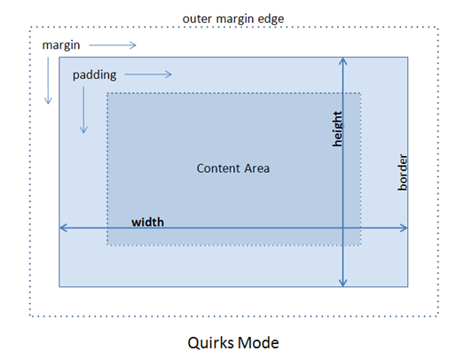
In Quirks mode, the width and height that you specify, includes padding and border. However, in case of the standards-compliant Transitional Mode, the width and height refer only to the content area and do not include padding and border, as shown in the following box model.
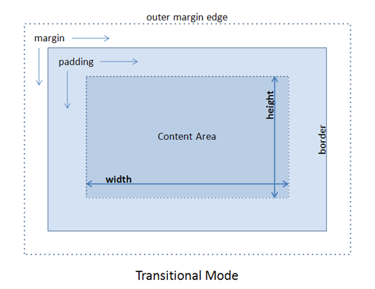
The box model used affects the rendering of elements, according to properties like width, height, margin, or padding that are assigned to it. To avoid variances in the rendering of elements in different browsers, it is important that the box models for all elements associated with width, height, margin, or padding be corrected to reflect the Transitional mode. Some common changes are described in the sections below.
Total rendered extent of an element
In the Quirks mode, if no margin is specified, the rendered extent of an element is the exact height and width specified. Typically, padding is used to create space, and the border to give a visual boundary to the element. The padding and the border must be calculated such that the total rendered extent of element is equal to the width and height values.
However, in the Transitional mode, the rendered element does not include the padding and border and these are added to form the element's rendered extent.
Hiding of elements by setting width and height to '0'
In cases where width is set as 0, transitional-mode applications continue to display the padding and border, since they fall outside the element. As negative values for width are not supported, you can use element.style.display = 'none' to completely hide the element.
Specifying 100% height and width
In the Transitional mode, when you specify an element to be 100% in width, and the element has a border, padding or margin, the rendered extent of the element will be more than 100%.
For example, consider an iframe inside a parent DIV, which is 500px wide and 200px high. Now, if you specify the iframe dimensions to be 100% wide and 100% high, and the iframe has a 1px border, you'll see a scroll bar on the DIV.
This is because the rendered width of the iframe itself is 500px, that is 100% of its parent DIV, and an additional two pixels is taken up by the borders on left and right-hand side of the iframe, making the effective rendered width 502px. By the same logic, the effective rendered height is 202px.
For such a case, it is advisable to use a negative-margin on the iframe to compensate for the border. Use of padding is not feasible as padding does not support negative values properly. Setting style="margin:-1px" on the iframe will compensate the 1px borders and make the iframe fit the parent DIV, without displaying scroll bars.
Another approach that can be used in the above scenario is to use "edge-positioning", that is to set position: absolute and define the four offsets for the iframe as follows.
New Usage: Standards compliant sample code in Transitional Mode iframe.customstyle { position:absolute; top:1px; left:1px; right:1px; bottom:1px; }
If you are using the XForms Designer, you need not specify custom CSS properties, as these can be defined through the property sheet of the XForm. For details, see the next section about the use of absolute positioning and anchoring.
Use of absolute position and anchoring in XForms Designer
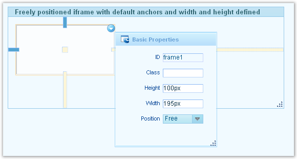
A control is said to have the absolute CSS position if its position is set asFreeand the layout of its parent control or XForm is also set asFreein the XForms Designer. In such a case, it is possible to apply anchors to the control and also specify the top, right, bottom, and left offsets, as desired. The width and height of a freely-positioned control is picked automatically based on the extent of control as seen in the XForms Designer.
If a freely-positioned control is not being displayed with the proper width and height, you may check and specify the correct width and height values in the Basic Properties of the control in XForms Designer. For a freely-positioned control, a default anchor appears on two adjacent edges as seen from the anchoring guides, and must have positive values of width and height as seen from the Basic Properties.
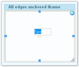
Now, if all four sides are anchored, the XForms designer considers all four offsets and does the required adjustments to make the control fit the parent, an exception being the case where '0' is defined as the offset for a control that has 1px border, as is the case with the above iframe example. In such cases, an offset of '1' must be used.
Scroll bars appearing in pages migrated to Transitional mode
When a page is migrated from C3 and is updated according to the Transitional mode, it may happen that certain areas of the page start displaying scroll bars. This may be due to the changes made to the box model; refer to the sections above to correct the problem.
If the issue persists, it is recommended to check the widths and heights of respective controls. You may also choose to reset the widths to 'default' from the context menu of control, or may assign explicit width values that do not result in scroll bars.
For transitional-mode pages, it is imperative that the controls have heights explicitly specified; the same must be verified in the XForms Designer.
Using the Quirks box model
The CSS3 property,box-sizing, enables you to choose the box model to employ for a particular element. You can use the box-sizing property as follows.
New Usage: Standards compliant sample code in Transitional Mode -moz-box-sizing : content-box; -webkit-box-sizing : content-box; /* sets the box model to CSS2.1 or transitional box model */ -moz-box-sizing : border-box; -webkit-box-sizing : border-box; /* sets the box model to quirks box model */
This is a rather recent property and the Process Platform XForms pages do not make use of this so far. All Process Platform pages follow CSS2.1 Transitional box model only. This property is recorded here as a helpful tip but not as recommendation or example of usage.
Properties and Syntax
Unitless values in Quirks Mode
In the Quirks mode, the values without units are automatically assumed to have units. In transitional mode, the units need to be specified to have the correct value picked up.
Old Usage: Standards non-compliant sample code in Quirks Mode Quirks model accepts (but bad practice) h1 {color: FF0000;} /* missing the octothorpe!, but interpreted as #FF0000 */ h2 {font-size: 18 px;} /* one too many spaces, but interpreted as 18px */ div {width: 500;} /* where's the unit? interpreted as 500px */
In Transitional mode this is not acceptable, and the units have to be specified explicitly.
New Usage: Standards compliant sample code in Transitional Mode Transitional mode needs correct units h1 {color: #FF0000;} h2 {font-size: 18px;} div {width: 500px;}
Width of Inline Elements
In Quirks mode, an inline element can have a width, as follows:
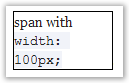
In Transitional mode, the width of an inline elements is ignored:
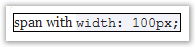
This difference applies to all inline elements, whether they are inline by semantics (for example, span) or a block-level element that is specified as inline through CSS (for example,<div style="display:inline">).
Overflow:visible property
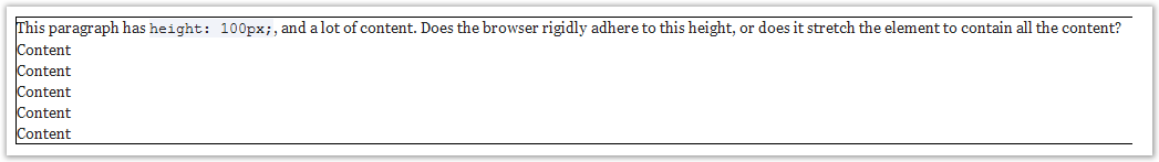
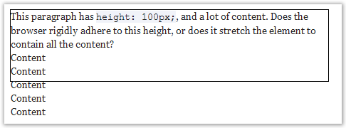
In an element with a fixed height and associated with the overflow:visible property (which is default), if the content is too long then:
- in Quirks mode, it stretches up the elements to accommodate all the content.
- in Transitional mode, the content should flow out of the element.
Cursor:hand property
Firefox does not recognize the cursor:hand style property. Use the cursor:pointer style property instead.
Filters
'Filter is an Internet Explorer-specific CSS property that does not work on any other browser. Internet Explorer Filters may be used for achieving common effects like setting opacity, making gradient, and drawing shadows on elements.
Opacity
Modern browsers accepts the CSS 3 property 'opacity', but the Internet Explorer still uses the Alpha filter for opacity. In order to be multi-browser complaint, it is advisable to use all declarations, as shown in below example where an opacity of 60% is achieved.
New Usage: Standards compliant sample code in Transitional Mode filter:progid:DXImageTransform.Microsoft.Alpha(opacity=60); opacity:0.6;
Gradient
Gradient filter is not supported in any browser except Internet Explorer. To support gradient, create a PNG image that can be set as background image and repeat it in x or y direction as per the effect desired.
For example, you can create an image that looks like:

Add the following style properties to the DIV or element that should have the gradient effect.
New Usage: Standards compliant sample code in Transitional Mode width:100px; height:40px; border:1px solid; background-image:url('gradient.png'); background-repeat:repeat-x;
Please note the PNG images are rendered with a blue box around the transparent areas in Internet Explorer
A GIF image can also be used in place of the PNG image. However, GIF images,
- do not support alpha transparency that is important for the background color to show through.
- cannot be used on different background color, and requires different images for different background colors.
- show flakes if placed on an area other than it is designed for.
The PNG images are more generic and can be reused on any range of backgrounds.
Spaces in filter
In Transitional mode you must not use spaces in a filter.
Old Usage: Standards non-compliant sample code in Quirks Mode unacceptable usage with a space after ':' filter: progid:DXImageTransform.Microsoft.Gradient(GradientType=0,StartColorStr= '#20ffcd00',EndColorStr= '#30ffcd00');
The CSS properties following such a filter, including the filter itself, are ignored. Ensure there is no space after ":" in style property, or after "=" of the inline attribute for filter.
New Usage: Standards compliant sample code in Transitional Mode acceptable usage without any spaces filter:progid:DXImageTransform.Microsoft.Gradient(GradientType=0,StartColorStr='#20ffcd00',EndColorStr='#30ffcd00');
Text Properties
CSS properties like word-wrap and text-overflow are supported by Internet Explorer, but not by other browsers. As a result, browsers other than the Internet Explorer may display overflowing text and no ellipsis. You can prevent the overflow of text by using the correct width/height and overflow combination. Word-wrap is supported in Firefox version 3.5 and later.
Browsers other than the Internet Explorer do not support the writing-mode: tb-rlCSS property that is used for writing vertical text. There is a possibility to use proprietary Firefox and webkit properties as shown below.
-webkit-transform: rotate(90deg); -moz-transform: rotate(90deg);
These are available in Firefox 3.5+, Apple Safari 4+, and Google Chrome2+.
Rounded Corners using border
The CSS 3 specification recommends a new property border-radius. It is not supported in most browsers yet. But Firefox, and webkit based browsers like Chrome and Safari have implemented their own proprietary properties. So the following code can be used to achieve rounded corners in Firefox and webkit based browsers.
-moz-border-radius: 5px; -webkit-border-radius: 5px
This is not supported in Internet Explorer.
There is a slight difference between Firefox and webkit based browsers when it comes to create rounded corners selectively. The syntax for creating specific corners is as follows.
-moz-border-radius-topleft : 5px; -webkit-border-top-left-radius : 5px; -moz-border-radius-topright : 5px; -webkit-border-top-right-radius : 5px; -moz-border-radius-bottomleft : 5px; -webkit-border-bottom-left-radius : 5px; -moz-border-radius-bottomright : 5px; -webkit-border-bottom-right-radius : 5px;
Changing scroll bar colors
In Internet Explorer you can change the style of the scroll bars. To do so, you can use the CSS properties as shown below.
New Usage: Standards compliant sample code in Transitional Mode scrollbar-3dlight-color: #f7f9f5; scrollbar-arrow-color: #406593; scrollbar-darkshadow-color: #f7f9f5; scrollbar-face-color: #dde8f9; scrollbar-highlight-color: #c2d8f2; scrollbar-shadow-color: #c2d8f2; scrollbar-track-color: #f7f9f5;
All the above mentioned styles are Internet Explorer specific and are not supported by Firefox. There seems to be no alternative for Firefox. Apple Safari 4 supports styling of scrollbars, other webkit based browsers like Chrome do not support it in current release, but may support it in future releases.
PNG Images
The PNG images are not rendered correctly in Internet Explorer 6 because the Internet Explorer 6 does not support Alpha transparency in PNG images.
Alpha transparency adds an additional channel in the PNG image to handle semi-transparent areas. This helps in smoothing the edges and achieving transparent gradients in images.
The only downside of using PNG images in Internet Explorer 6 is a 'blue' box that is rendered. This does not affect the functionality in any way, but mars the overall appearance of page.
The modern browsers, Internet Explorer 7, and later versions of the Internet Explorer browser support PNG images properly.